Select your language:
Follow us:
Select your language:
Follow us:
HUGO PRATT COMICS AWARDS – THE WINNERS
In the name of Hugo Pratt, an award for young comic artists from European schools.
Thirty years after the death of the great Venetian artist and almost 100 years after his birth, the award ceremony for the first edition of the Hugo Pratt Comics Award, reserved for students of European comic schools, was held in Senigallia on 25 October 2025. The works were evaluated by a jury of 22 people, including journalists, writers and communication experts, who analysed the works of the young talents in the five categories of the Award: best original story, best drawing, best screenplay, best colouring and best cover. In addition to a commemorative plaque, the winning authors will see their stories published in a volume printed on Favini – Crush Mais eco-friendly paper, which will be distributed free of charge in Mondadori – Rizzoli bookshops.
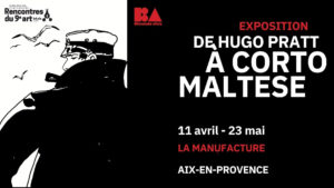
Furthermore, the winners’ illustrations will be on display on the ground floor of the Rocca Roveresca in Senigallia until 30 November, together with an exhibition dedicated to the life, works and readings of Hugo Pratt.
Reasoning:
A tale of survival and mutual dependence, where tenderness coexists with violence. A Chill Guy delves into the fragility of bonds, showing how, even in chaos, humanity can resist in unexpected ways — even in the face of a monster.
Dario D’Angelo pens an intense and disturbing story, set in a world that seems to be at the end of everything.
A man and a ferocious creature, bound by a primordial affection, struggle to survive amid ruins, machines and blood. The seemingly ironic title becomes a tragic mask: behind the calm lies a deep despair, a desperate attempt to remain alive and human, while the narrative alternates between explosions of violence and moments of fragile quiet. The protagonist, between black humour and disenchantment, experiences an absurd and tender relationship with his animal shadow: a companion, an alter ego, perhaps a reflection of man’s most instinctive side. A narrative that blends pulp and poetry, in a precarious balance that closely resembles our own time.
Reasoning:
An instinctive, precise style that combines elegance and unease. Every stroke of Dark Days is light emerging from darkness, a wound that reveals rather than conceals. With mature technical mastery and uncommon visual sensitivity, Dark Days explores shadow as a language. The figures seem sculpted by chiaroscuro, in a constant balance between density and lightness.
It is a design that reinvents reality without imitating it, seeking beauty in its cracks and suffering. A personal graphic voice, capable of combining contemporary energy and emotional depth.
Reasoning:
A dry writing style, dense with silence and wind. COAL is a descent into memory and the industrial landscape, where the machine becomes a symbol of humanity digging into itself.
In COAL, humanity survives among the ruins of progress: a lucid and painful tale that transforms the industrial landscape into a moral frontier. Set in a German village on the brink of destruction, COAL depicts the last man left to defend what remains of his land. The text alternates between introspection and civil tension, intertwining environmental chronicle with personal drama.
The script is dry, controlled, but deeply emotional: every word weighs like a wound, every silence is a form of resistance. Collombel and Gronen construct a story where machine and man face each other as two relics of the same failure, and where rebellion becomes the last possible gesture of dignity.
Reasoning:
Colours that don’t just accompany the story, but tell it. In the suspended world of the Baron, every shade becomes wind, light, silence. Freely inspired by Calvino’s novel, The Baron in the Trees transforms colour into narrative voice. The hues, at times soft and contemplative, blend with sudden contrasts that mark the transition between reality and imagination. The use of colour is mature, poetic, never decorative: it constructs time, suggests memory, evokes the vertigo of flight and the lightness of thought. A test of balance and sensitivity that makes colour a form of writing.
Reasoning:
A cover that vibrates with energy and irony. At a glance, The Artists’ Planet transports us into a universe that breathes creativity, madness and wonder.
With its bold composition and skilful use of colour contrasts, The Artists’ Planet captures the spirit of comics as an open and constantly evolving language. The cover becomes a story: it invites, intrigues and reveals a world where drawing is a living, fluid matter, full of movement. A visual statement of intent that celebrates art as a journey and irony as a form of freedom.
The latest news from the world of Cong